
How Three Charts Can All Be Right
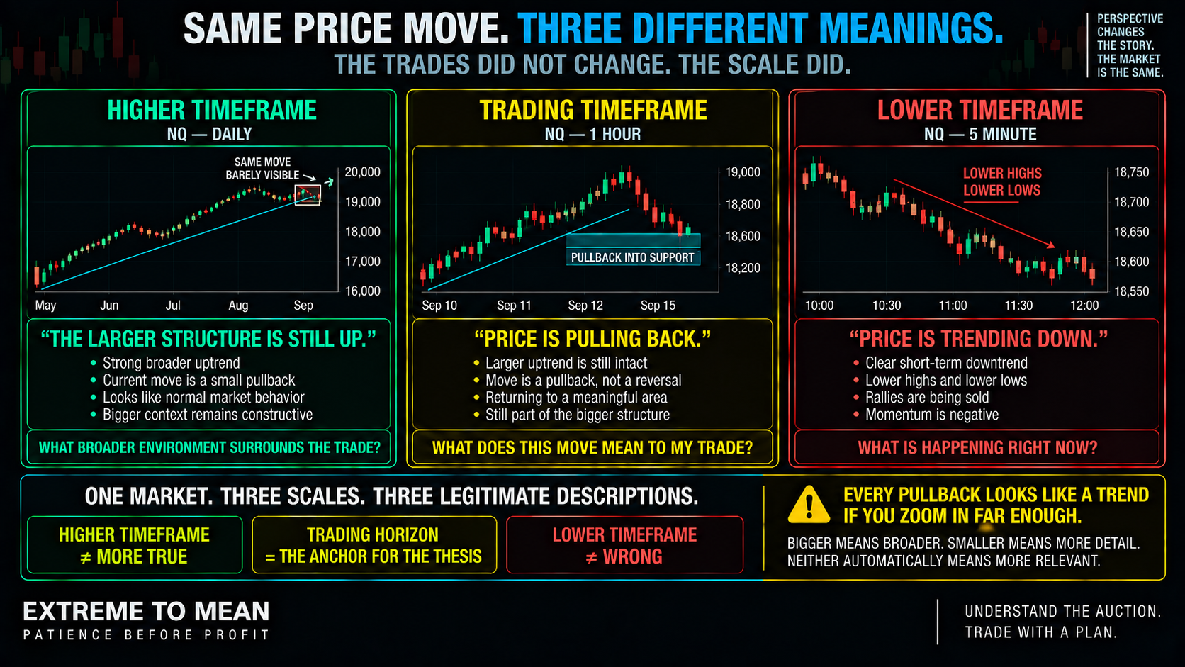
Imagine NQ has sold off sharply for twenty minutes. On a fast intraday chart, price is making lower highs and lower lows, rallies are failing, and momentum looks plainly bearish. Zoom out to the trading horizon and the same decline may look like a routine pullback into support inside an otherwise healthy advance.
Zoom out again and the entire move may barely register inside a broader uptrend. The trades that occurred have not changed, and neither has the price history. What changed is how much activity the chart compressed into each visual unit.
The Market curriculum helps organize those questions before a trader treats detail as context.
This is why saying simply, “The trend is bearish,” is incomplete. Bearish for the next several minutes can coexist with bullish over the next several hours or days. The market comes first, but the trader still has to decide which part of that market actually owns the decision.
A Timeframe Changes the View, Not the Market
A one-minute candle summarizes a small slice of trading, while a fifteen-minute, hourly, or daily candle compresses progressively more activity. Smaller charts expose more of the movement that occurred between larger reference points. Larger charts hide much of that intermediate motion and make broader structure easier to see.
More detail therefore does not automatically mean more useful information. A tiny chart may reveal ten swings that have almost no relevance to the thesis being traded, while a broader chart may remove the clutter but hide execution detail that matters to a short-term strategy. The right question is not which chart contains the most information, but which information is relevant to the job.
That distinction becomes especially important in different market states. A broad range can contain excellent smaller-horizon trends, and a strong larger trend can contain violent countertrend moves. Bigger does not mean more true; it means broader.
The Tide, Wave, and Ripple Model
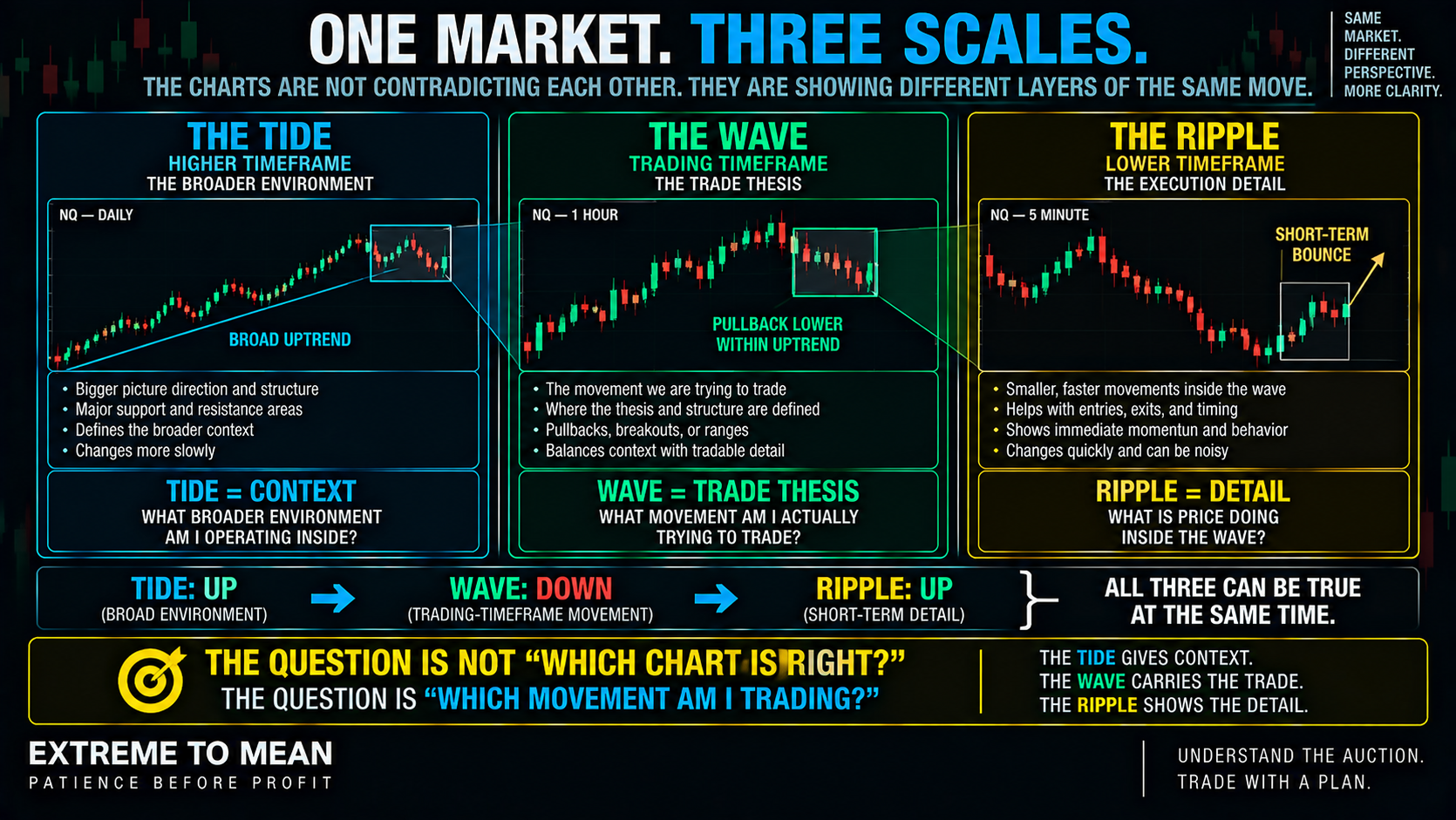
Think of the market as three nested layers. The tide is the broader environment, the wave is the movement the trade is actually trying to capture, and the ripple is the smaller behavior unfolding inside that move. The metaphor describes roles, not mandatory chart settings.
The tide provides the larger context. It can show a broader trend, range, important structural area, extension, or transition that surrounds the trade. It is deliberately slower and should not be expected to change every time a smaller chart reverses direction.
The wave is the most important layer for the specific trade because it is where the thesis lives. A continuation trader may be trying to capture a pullback and resumption, a mean-reversion trader may be trading temporary movement back toward balance, and a breakout trader may be evaluating acceptance beyond a range. The wave defines what price is actually being asked to do.
The ripple provides smaller detail inside that thesis. It can show acceleration, hesitation, rejection, failed continuation, or renewed pressure, but every change on the ripple does not automatically redefine the wave. The tide gives context, the wave carries the trade, and the ripple shows the detail.
The Trading Horizon Should Anchor the Decision
Traders often assume the highest timeframe automatically deserves final authority. Broader charts provide valuable context, but the trade still needs a center of gravity: the horizon on which its thesis, invalidation, and expected movement actually make sense. The higher timeframe provides context; the trading timeframe defines the job.
Suppose the trade is an intraday continuation idea. A daily chart may show the broader backdrop, and a faster chart may help observe whether momentum is returning, but neither should quietly replace the intraday structure that created the idea. Different timeframes can perform different jobs while still belonging to one coherent trade.
This is also why location is the first filter only after we know which horizon gives that location meaning. An intraday high can be important to a short-term strategy and irrelevant to someone trading several sessions of movement. A location is not universally important simply because a line exists on a chart.
Markets Are Nested
A daily uptrend can contain an hourly pullback, that pullback can contain a fifteen-minute downtrend, and that downtrend can contain a three-minute rally. All four descriptions can be accurate simultaneously because they describe different layers of one continuous auction. Direction without a horizon is an incomplete statement.
Momentum is nested in the same way. Strong selling on a fast chart may represent a normal pullback, the early stages of a deeper correction, or the beginning of a larger change that has not yet developed. A strong move on the ripple does not automatically change the tide, although the ripple can sometimes provide the first evidence that a larger change may eventually be developing.
Location also changes with scale. Price can look extremely stretched from a fast intraday reference while remaining completely ordinary relative to an hourly structure, and the entire move may be negligible on the daily chart. “Price is extended” therefore needs a second question: extended relative to which reference and which horizon?
That same principle applies to the mean. Different horizons can naturally organize price around different evolving reference points, so price can be far from one mean while remaining close to another. The dedicated lesson on what the mean really is provides the foundation; the next curriculum lesson will go deeper into why the reference itself keeps changing.
More Timeframes Can Create More Ways to Fool Yourself
One of the easiest ways to misuse multiple timeframes is to keep changing charts until one supports the trade you already want. A trader wanting to short can zoom in until a tiny bearish structure appears, while a trader holding a loser can zoom out until a distant support level provides an excuse to stay. Timeframe shopping is confirmation bias with a zoom button.
Every healthy trend contains smaller counter-moves when viewed closely enough. A trader can almost always find a lower high, broken micro level, bearish candle, or short-term momentum reversal if they zoom in far enough. Every pullback looks like a trend if you zoom in far enough.
The opposite mistake occurs after entry. A short-term trade fails, the original invalidation is reached, and the trader suddenly decides the four-hour chart still looks supportive. Zooming out after the trade fails does not create a new thesis; it often creates an excuse.
The same problem can hurt larger-horizon trades in reverse. Watching every one-minute fluctuation can turn ordinary movement into an emotional emergency and cause a trader to abandon a thesis that remains structurally intact. The zoom level can change your emotion faster than it changes the information relevant to your trade.
Timeframe Alignment Is Helpful—Not Mandatory
When the tide, wave, and ripple broadly support the same directional story, interpretation can be easier. A broader uptrend, a trading-horizon pullback into structure, and renewed short-term buying pressure form a straightforward continuation question. Alignment can make the story simpler, but it does not make alignment a universal requirement.
Mean reversion shows why. The tide may remain bullish while the wave becomes unusually extended and the ripple begins losing upside momentum, creating a coherent thesis for a temporary correction rather than a declaration that the larger trend has reversed. Different layers can point in different directions while still describing one sensible trade idea.
A structural break also belongs to the horizon on which it occurred. Breaking a minor intraday swing can matter greatly to a short-term trader while remaining invisible to the larger structure. A reversal should be proven on the horizon you are claiming has reversed.
Keep the Horizon Consistent With the Trade
Chart timeframe, trade horizon, and holding period are related, but they are not identical. A trader may use a small chart to help execute a larger-horizon thesis, or use a broad chart for context around a short intraday trade. A five-minute chart does not automatically mean a five-minute holding period.
The important requirement is internal consistency. The entry, thesis, invalidation, and target can use different layers, but those layers still need to belong to one trade plan. An entry from a tiny chart, thesis from an intraday chart, stop moved to distant higher-timeframe support after entry, and target borrowed from a daily chart is not sophisticated multi-timeframe analysis.
Volatility can make this harder because larger intraday swings may become normal without changing the broader structure. That is why market conditions change the quality of a setup, including what counts as meaningful movement versus ordinary noise. Noise is movement that matters less than the horizon you are trading.
The ETM Tide-Wave-Ripple Framework
The goal is not to keep adding charts. It is to define the trade horizon first, assign a job to each layer, and refuse to change those jobs simply because the market becomes uncomfortable. Three layers of thinking do not require three charts on your monitor.
- Trade horizon — What movement am I actually trying to capture?
- Tide — What broader environment surrounds that trade?
- Wave — What price behavior creates the actual thesis?
- Ripple — What smaller detail would genuinely improve the decision?
- Relationship — Is the wave moving with the tide, pulling back against it, stretched away from it, or potentially changing it?
- Thesis — What am I asking price to do on the trading horizon?
- Invalidation — What behavior on the relevant horizon proves that thesis wrong?
- Target — Does the expected move belong to the same general thesis?
- Conflict — Is another timeframe providing useful evidence or merely emotional noise?
- Decision — Enter, wait, or pass.
The condensed sequence is Horizon → Tide → Wave → Ripple → Thesis → Risk → Decision. The higher horizon supplies perspective, the trading horizon remains the center of gravity, and lower-horizon information earns a place only when it improves a defined decision. Choose the timeframe because of the strategy—not because of the answer you want.
The better question is not, “Which timeframe is right?” Ask, “Which horizon owns this decision, and what job is each additional timeframe supposed to perform?” That keeps multiple-timeframe analysis from turning into a search for whichever chart agrees with you.
Final Thought
Markets move in layers. A rally on one timeframe can be a bounce inside a decline on another, and that entire decline can still be a pullback inside a larger advance. The charts are not contradicting one another; they are compressing the same market at different scales.
Define the movement you actually intend to trade before the market becomes emotional. Use the tide for broader context, let the wave define the thesis, and consult the ripple only when its additional detail has a clear job. More timeframes can create more context—or simply more ways to disagree with yourself.
Timeframe discipline is decision discipline. When you know which movement matters, many smaller fluctuations stop demanding action, and a broader chart stops becoming an excuse to rescue a failed short-term thesis. That market-first approach is part of the broader Extreme to Mean system.
Educational content only. Trading involves substantial risk and is not suitable for everyone.