
Support and resistance are among the first concepts traders learn. Support is generally described as an area where a decline may slow or attract buyers, while resistance is an area where an advance may slow or attract sellers. The definitions are useful, but they can encourage traders to mark every visible reaction as though each one carries the same importance.
A chart can quickly become covered with swing highs, swing lows, candle wicks, round numbers, moving averages, previous closes, and minor pauses. When every price is marked, nothing stands out, and the trader can usually find a nearby line to support almost any decision. The chart looks detailed, but the analysis becomes less disciplined because no clear hierarchy remains.
The purpose of support and resistance is not to decorate the chart or predict the exact price where the market must reverse. These areas should organize structure, identify locations where participation may change, and help the trader prepare before price arrives. The broader market structure and context curriculum follows the same principle: information becomes useful only when the trader knows which evidence deserves priority.
Support and Resistance Describe Previous Behavior
A support or resistance area begins with something the market has already shown. Support identifies a region where selling stopped producing the same downward progress because buyers became more active, sellers lost pressure, or both occurred strongly enough to change the character of price. Resistance reflects the opposite situation, where buying stopped producing the same upward progress and sellers became more influential.
The area matters because it records a previous change in participation or control. The horizontal line is only a visual tool used to remember where that change occurred. Drawing the line does not create importance that was not already present in the market’s behavior.
That history does not guarantee that the same response will occur when price returns. Support can break, resistance can fail, and a strong trend can move through an area that previously produced a reversal. The level gives the trader a reason to pay closer attention, but the current approach and reaction still determine what the area means now.
A support or resistance zone should therefore be treated as a reference point rather than a prediction. The trader must examine the larger market structure, how price approaches the area, and whether the new interaction produces evidence of rejection, acceptance, continuation, or failure. The previous response earns attention; the current response determines whether the level remains useful.
A Meaningful Level Should Change the Story
A level deserves attention when the behavior around it affected the larger structure of the chart. A minor intraday high that pauses price for two candles before the advance continues may be visible, but it did not materially change the market. Marking it permanently can give a small reaction more authority than it deserves.
Now compare that with an area where price was rejected several times, broke a developing trend, created a large directional move, or formed the boundary of a well-defined range. That location changed what the market was doing and influenced what happened next. Its role in the structure gives the trader a stronger reason to monitor it again.
A previous session's high or low is a common example of this kind of level, and how price behaves when it revisits that boundary often says more than the line itself.
A useful level should help answer a structural question. It may show where buyers repeatedly defended an area, where sellers prevented further progress, where balance turned into expansion, or where a breakout later held from the opposite side. The strongest levels are not necessarily the ones with the most technical names attached to them; they are the ones that clearly affected control, direction, or market organization.
This is why market structure should be understood before individual levels. A swing high matters more when it controls the trend, defines the top of a range, or marks a genuine change in behavior than when it is simply one of many small reactions inside noise. The level should contribute to the market’s story rather than merely occupy space on the chart.
Repetition Can Add Meaning
Repeated reactions can make an area more visible because buyers or sellers have responded there more than once. If several declines reach the same general region and produce meaningful recoveries, the area may begin functioning as support. If multiple advances fail near the same region and selling repeatedly pushes price away, the zone may become recognizable resistance.
Those reactions do not need to begin at one exact number. Markets operate as auctions involving different orders, participants, execution prices, and time horizons, so the useful reference is often an area rather than a single line. That is the central lesson in why a good location is a zone rather than a perfect price.
Repeated touches alone are not enough to make a level important. An area that causes several brief pauses but no meaningful displacement may be less useful than one that produced a single decisive rejection and a clear structural change. The trader should evaluate what happened after each interaction rather than counting touches mechanically.
The quality of the response matters as much as the number of responses. Strong movement away from the area, a break in nearby structure, or sustained follow-through communicates more than repeated hesitation that never develops. Repetition can strengthen the case for attention, but it cannot replace evidence that the level actually influenced the market.
Follow-Through Shows Whether the Reaction Mattered
A quick wick or one opposing candle can make a level look important, but the movement that follows reveals how much influence the area actually had. Suppose price reaches resistance, prints one bearish candle, and then continues higher almost immediately. Sellers appeared, but they did not maintain enough control to change the market.
Now imagine price reaches the same area, fails to continue, forms a lower high, breaks a nearby swing low, and begins moving away with expanding candles. That response contains more evidence because the reaction changed short-term structure and created distance from the zone. The first example produced a pause, while the second altered the market’s behavior.
When reviewing a level, the trader should examine whether the previous response broke structure, created sustained momentum, produced meaningful distance, or began a lasting directional change. Strong follow-through helps explain why the location may deserve attention again. Weak follow-through suggests that the area was visible without being especially influential.
A strong previous reaction still does not guarantee another one. It means the area has earned a place in preparation because it previously affected participation or control in a meaningful way. The trader should return to the level with awareness, not certainty.
Higher-Timeframe Levels Usually Carry More Context
A level visible on a daily or weekly chart has generally developed through more time and market participation than a small reaction visible only on a one-minute chart. More candles, more trading sessions, and more participants may have contributed to the larger structure. That broader history often gives the area more relevance across different trading approaches.
This does not make every higher-timeframe line important or every lower-timeframe level useless. A weekly chart can still contain old or irrelevant references, while a five-minute level may be essential for refining an intraday decision. The trader needs a hierarchy rather than a rule that automatically favors every larger timeframe.
A weekly swing high may influence a day trade because many participants can see it and because the area represents a significant structural boundary. A smaller intraday level may then help the trader understand the immediate approach or define an entry. The lower timeframe adds precision without being allowed to outrank the larger market map.
Problems develop when the trader begins with the smallest chart and marks every visible turn before understanding the broader structure. Lower timeframes contain many more reactions, so the chart quickly fills with references that compete for attention. A cleaner process starts with the larger structure and moves lower only when additional detail is needed for the current decision.
Liquidity Can Increase a Level’s Importance
Support and resistance often matter because visible areas attract attention and orders. Prior highs may contain breakout orders, protective stops, profit-taking, and traders waiting to sell, while prior lows may contain stops, buying interest, or traders attempting to participate in a breakdown. This concentration can increase activity when price reaches the area.
The market may reject the zone, pause around it, break through it, or accelerate once enough orders have been filled. Liquidity does not determine in advance which response will occur, but it helps explain why obvious levels can become active decision points. The related lesson on why liquidity matters around obvious levels develops this relationship further.
A visible level can also attract price without ultimately holding. The market may move toward a prior high because orders are concentrated there, trade through the area, and continue once that liquidity has been absorbed. A trader who assumes the level must reverse price may mistake increased activity for confirmation.
The zone should therefore be treated as an area where the market may reveal useful information. Liquidity explains why participation can increase, while the reaction shows whether buyers or sellers gained control. The trader must observe the result rather than assigning an outcome before price arrives.
Too Many Levels Create Decision Clutter
Drawing many levels can feel responsible because the trader assumes that more information creates better preparation. In practice, excessive marking often produces the opposite result. A chart crowded with horizontal lines makes it difficult to distinguish major structure from minor noise.
When price is always approaching, touching, or leaving a marked area, nearly every candle can be interpreted as technically important. A trader who wants to buy can point to nearby support, while one who wants to sell can identify nearby resistance. The chart no longer filters decisions because it can justify whichever action the trader already prefers.
The mistake is understandable because each line can usually be connected to something that happened. A minor wick, a brief pause, and a small reaction are all real market events. Their existence does not automatically make them useful permanent references.
A level should remain on the chart only when it contributes to the current market map or a decision being actively evaluated. References that no longer affect structure, location, invalidation, or available room should be removed or left unmarked. Selectivity allows the important areas to stand out without competition from every historical reaction.
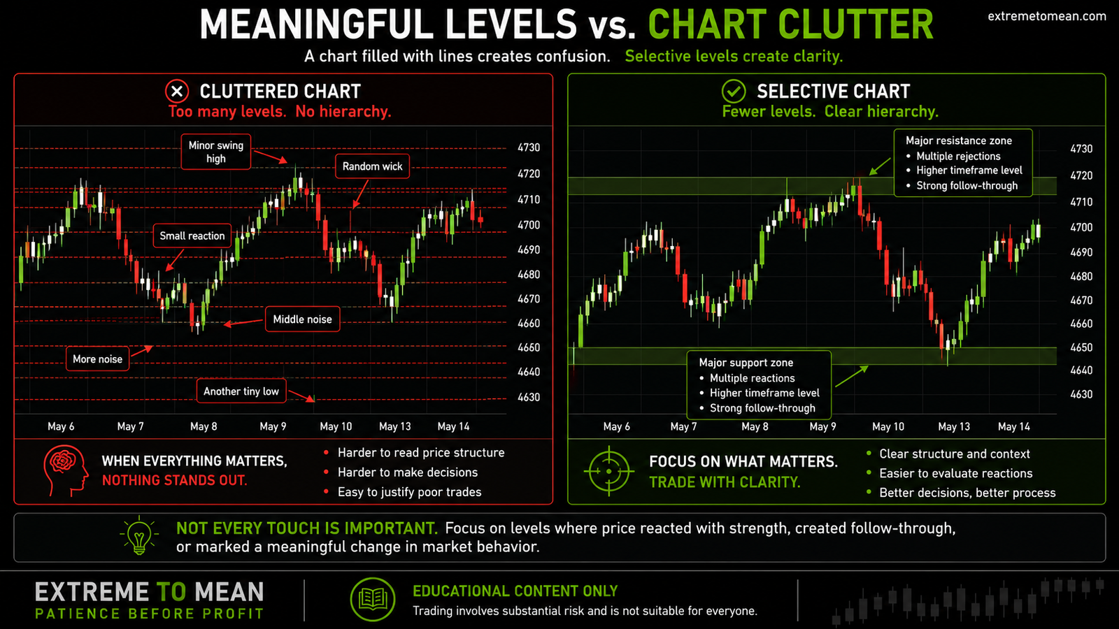
A clean chart should make the hierarchy obvious. Major support and resistance areas should be visible immediately, while smaller references remain secondary or are added only when the current trade requires them. The goal is not a blank chart; it is a chart in which each marked area has a clear job.
Levels Can Weaken Through Repeated Testing
Traders sometimes assume that every successful test makes a support or resistance level stronger. Repeated responses can make the area more visible, but repeated tests can also consume the buying or selling interest that previously defended it. The number of holds matters less than how the quality of those holds changes.
Suppose buyers repeatedly support the same area. Each test may require additional buying to absorb incoming selling pressure. If the recoveries become smaller, momentum weakens, and price returns more quickly after each bounce, the level may be losing effectiveness even though it has not yet broken.
The same process can occur at resistance. Sellers may continue responding, but each rejection travels a shorter distance while price spends more time near the upper boundary. The market may be accepting higher prices gradually even though the resistance line still appears to be holding.
The trader should therefore compare the strength, distance, and duration of each response. A sharp rejection that immediately creates separation from the level communicates something different from repeated shallow reactions while price keeps pressing against the same boundary. The market’s behavior around the level remains more important than the label assigned to it.
Broken Levels Can Change Roles
When support breaks, the same area may later act as resistance, while broken resistance may later provide support. This role reversal can occur because the break changes the positions and expectations of traders who were active around the level. Participants who became trapped may use a return to the area as an opportunity to exit.
Traders who bought support and remained in the position during a breakdown may sell if price returns to their original entry region. Traders who sold resistance and were caught by a breakout may buy back or close their positions during a retest. New participants may also interpret the break as evidence that the market has accepted a different price range.
The role change is not automatic simply because price crossed the line. A brief move through resistance followed by an immediate return may be a failed breakout rather than a genuine transition to support. The trader still needs evidence that price accepted beyond the area and that the retest produced a meaningful response.
A stronger role reversal usually includes a break that creates distance, holds beyond the zone, and later survives a return. Even then, the area remains a location for evaluation rather than a guaranteed entry. The reaction must confirm whether the market is accepting or rejecting the new side of the level.
The Level Is Not the Trade
A meaningful support or resistance area can improve the quality of a trading decision, but reaching the area does not complete the setup. Price can reach support and continue lower, or reach resistance and continue higher. Strong trends often move through areas that would create larger reactions under calmer conditions.
This is why context comes before the candle. The trader must understand whether the market is trending, balancing, chopping, expanding, or reverting before deciding what a level means. The same support zone can offer a useful location in one environment and little more than a temporary pause in another.
The approach into the zone also provides information. A slow, overlapping move communicates something different from a fast, one-sided advance or decline. The trader should observe whether momentum is strengthening, weakening, compressing, or becoming unstable as price nears the area.
Once price reaches the zone, the reaction must be evaluated rather than assumed. Rejection, acceptance, stabilization, structural failure, and follow-through can lead to very different decisions. Only after that behavior is visible can the trader determine whether an entry, invalidation point, realistic target, and acceptable amount of risk can be defined.
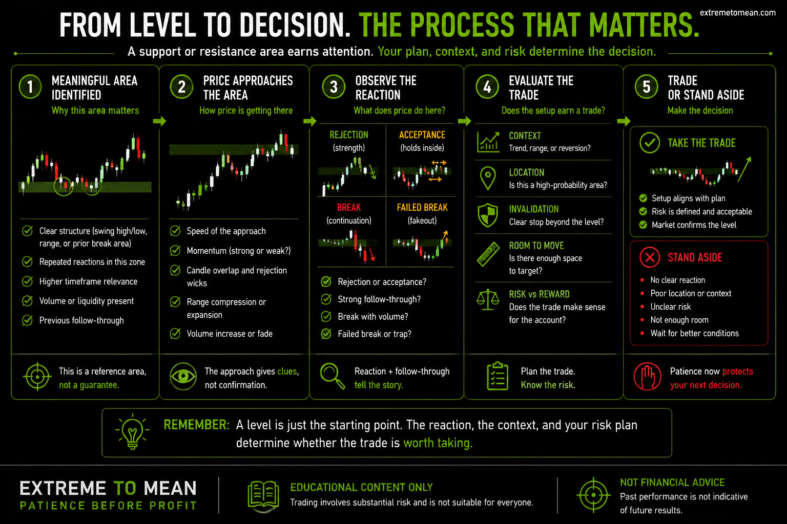
The level earns attention, but the complete trade must still earn participation. A useful location can exist without a qualified setup, and a reaction can occur without creating enough room or clear enough risk for a trade. Standing aside remains a valid outcome of the evaluation.
Build a Clear Level Hierarchy
A cleaner chart begins with a small number of major references. The trader should first identify higher-timeframe swing highs, swing lows, range boundaries, previous break areas, and zones that produced clear structural change. These locations form the primary map against which smaller decisions can be evaluated.
Intermediate levels should be added only when they help define the trade currently under consideration. A smaller reference may clarify an entry, invalidation point, or nearby obstacle, but it should not be marked simply because an empty part of the chart feels unfinished. Every additional line should make the decision easier to understand.
Levels should also be removed when they are no longer relevant. The market may move far enough away, create new structure, or trade through an old area repeatedly until the reference no longer contributes to current analysis. Support and resistance should be maintained like a working map rather than collected like permanent chart decorations.
A practical level-selection review should answer:
- Structural role: Did this area change trend, define a range, begin expansion, or create a meaningful reversal?
- Reaction quality: Did price move away with distance and follow-through, or merely pause briefly?
- Repetition: Have meaningful reactions occurred more than once without weakening substantially?
- Timeframe: Is the level visible on the timeframe controlling the current trade?
- Current relevance: Is price close enough, and is the area still part of the active market structure?
- Decision value: Does marking the level clarify location, invalidation, target, or available room?
This review creates a hierarchy and prevents every visible reaction from competing for attention. The better question is not how many levels can be identified, but which areas changed market behavior and could materially affect the decision being evaluated now. A selective chart supports preparation without becoming a maze.
The free trading tools and checklists can help organize location, context, confirmation, and risk before a level becomes part of a trade plan. Writing down why an area matters also makes it easier to remove lines that no longer serve a clear purpose. The goal is a chart that guides decisions rather than one that simply records history.
Final Thought
Support and resistance are useful because they help traders organize price around meaningful areas. A level matters when market behavior made it important through structural change, repeated reactions, strong follow-through, higher-timeframe relevance, or concentrated participation. A line does not become meaningful simply because it can be drawn.
Keep the chart selective by starting with the larger structure and marking only the areas that genuinely changed behavior. Observe how price approaches, evaluate the reaction after it arrives, and remove references that no longer improve the decision. Support and resistance should make the market easier to read rather than provide an explanation for every candle.
A meaningful level earns attention, not automatic participation. Context, current behavior, invalidation, available room, and risk must still support the trade. When those pieces do not align, the level can remain valid while the correct decision is to stand aside.
The role-change idea becomes practical in a breakout-and-retest setup, where acceptance or failure around the former boundary supplies the useful evidence.
Educational content only. Trading involves substantial risk and is not suitable for everyone.