
Many new traders open a chart and assume what they see is the market. If the chart looks fast, messy, and emotional, they think the market is fast, messy, and emotional. If the chart looks slow, smooth, and structured, they think the market is calm and organized.
But often, the difference is not the market itself. The difference is the timeframe.
A 1-minute chart and a daily chart can show the same stock, ETF, futures contract, or index. The price may belong to the same market, but the chart is organizing that price in a different way. One view shows tiny slices of time. The other shows much larger slices of time.
At Extreme to Mean, this belongs in The Basics lesson library because timeframe awareness comes before multi-timeframe context. Before a trader can understand higher timeframe structure, lower timeframe entries, or reversion-to-mean location, they need to understand what a timeframe actually means.
A Timeframe Tells You How Much Time Each Candle Represents
A chart timeframe tells you how much time is summarized inside each candle.
On a 1-minute chart, each candle represents one minute of price movement. On a 5-minute chart, each candle represents five minutes. On a 15-minute chart, each candle represents fifteen minutes. On a daily chart, each candle represents one full trading day.
That makes session awareness a natural next layer, because a trader should also understand what a trading session actually is before assuming every part of the day carries the same information.
The candle still has an open, high, low, and close. The difference is the amount of time being summarized. A 1-minute candle shows where price opened, how high it went, how low it went, and where it closed during one minute. A daily candle shows those same four pieces of information across the entire trading day.
That is why the earlier lesson on reading a candlestick matters. A candle is not just a shape. It is a time-based summary. Without knowing the timeframe, the candle’s meaning is incomplete.
A large candle on a 1-minute chart may represent a fast burst of movement. A large candle on a daily chart may represent an entire day of aggressive repricing. The visual idea is similar, but the amount of market behavior behind the candle is very different.
This is the first rule: always know what each candle represents before you try to interpret the chart.
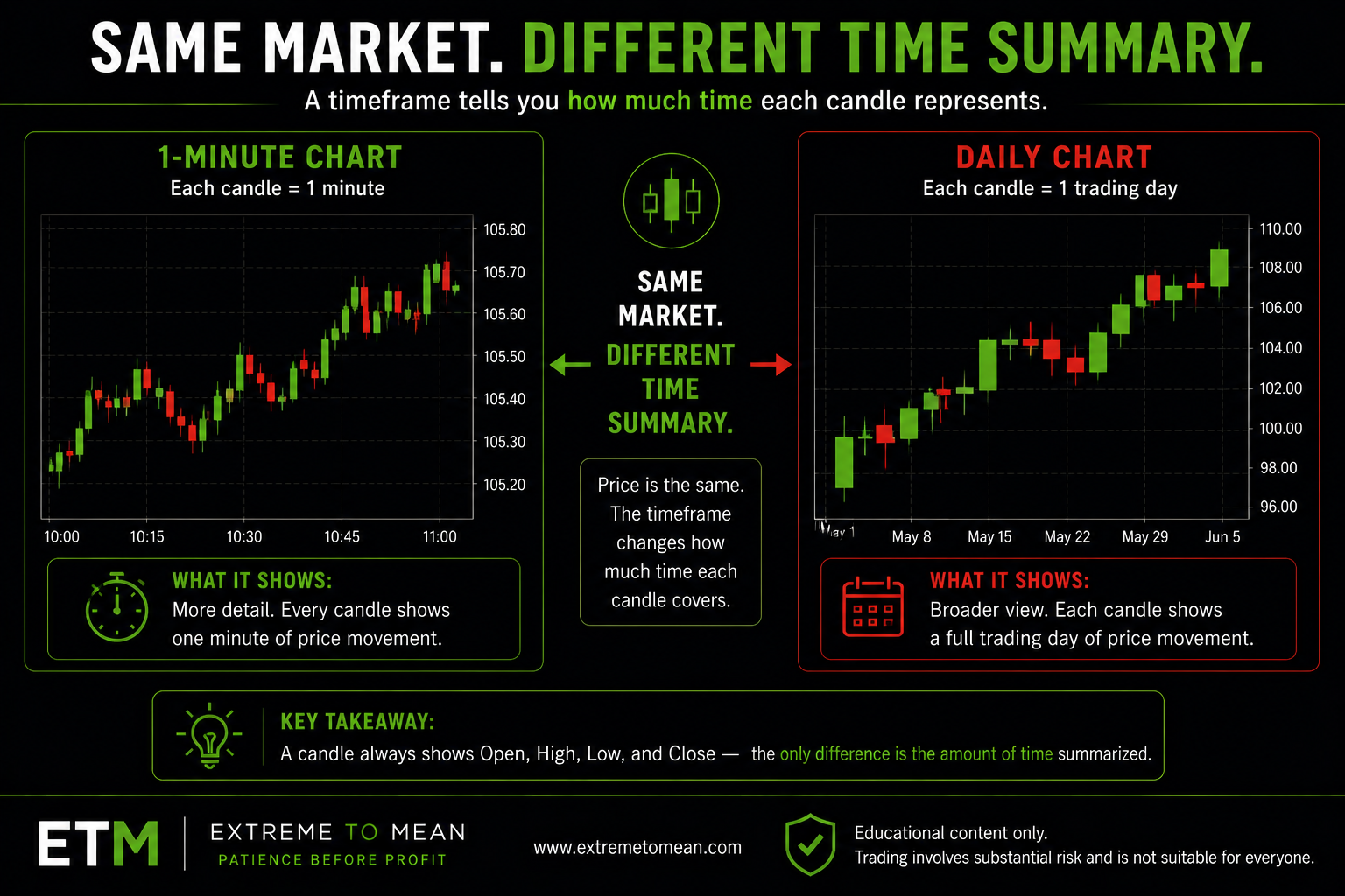
The Same Market Can Look Different on Different Timeframes
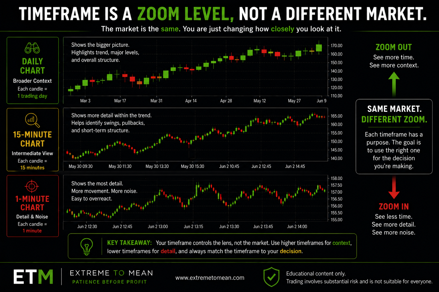
A timeframe is like a zoom level.
If you zoom in, you see more detail. If you zoom out, you see more context. Neither view is automatically right or wrong. They simply answer different questions.
A 1-minute chart can show small fluctuations, quick reactions, short bursts of buying or selling, and fast changes in direction. It can help a trader see detail, but it can also make every little movement feel important. What looks like a major shift on a 1-minute chart may be almost invisible on a daily chart.
A daily chart does the opposite. It compresses all the intraday movement into one candle per day. It hides many of the smaller moves but reveals broader structure. It can show whether price has been rising for weeks, stuck in a range, breaking down from a larger area, or returning to a previous level.
Both charts may be showing the same market at the same current price. But the story feels different because the chart is grouping time differently.
This is one reason beginners get confused. They may see a market looking bullish on a short timeframe while the larger chart still shows weakness. Or they may see a small pullback on a daily chart that looks like a full selloff on a 1-minute chart. The market did not change. The view changed.
A better trader does not ask, “Which chart is telling the truth?”
A better trader asks, “What is this timeframe showing me, and what is it leaving out?”
Short Timeframes Show Detail, but Also More Noise
Shorter timeframes show more individual movement.
On a 1-minute chart, every minute creates a new candle. That means the chart updates quickly. Price may appear to jump, hesitate, reverse, break, reclaim, and reject within a short amount of time. This can be useful, but it can also become distracting.
For beginners, short timeframes often feel exciting because they make the market look active. There is always something happening. A new candle forms quickly. A small move can look dramatic. A brief pause can feel like a setup. A quick color change can feel like a signal.
That reaction feels reasonable because short timeframes create urgency. The trader sees price moving and feels like the decision window is closing. But urgency is not the same as opportunity.
Short timeframes can make traders overreact to noise. Noise means movement that may not matter much in the larger picture. It can include small back-and-forth movement, random reactions, short-lived pushes, or temporary volatility that does not change the broader structure.
This does not mean short timeframes are useless. It means they require discipline. A short timeframe can help with detail, but it should not replace context. The trader still has to ask whether the movement matters, where price is located, and whether the risk is clear.
This connects to a core Extreme to Mean idea: the trader’s job is to evaluate, not react. A fast chart should not automatically create a fast decision.
Higher Timeframes Show Context, but Less Detail
Higher timeframes show a broader view.
A daily chart does not show every intraday fluctuation. It does not show every small reaction or every short-term push. Instead, it compresses the day into one candle. That makes the chart less detailed, but often easier to understand at a structural level.
A higher timeframe can help a trader see where price has been over a longer period. It may reveal larger ranges, previous highs and lows, trend direction, major turning areas, or places where price has reacted before. This can help the trader avoid treating a small move like it exists in isolation.
But higher timeframes are not perfect either. A daily chart can hide important intraday detail. It may not show how price moved inside the day. A daily candle might close strong, but the intraday path could have included a deep pullback, a failed breakout, or a messy range. The higher timeframe gives context, but not every detail.
That is why timeframe selection depends on the decision being made.
A long-term investor may care more about weekly or monthly charts. A day trader may care more about intraday charts. A swing trader may focus on daily and multi-day structure. The market is the same, but the decision horizon is different.
This is also why later Extreme to Mean lessons use market context before setup interpretation. The lesson on context before the candle becomes easier to understand once a trader realizes that one candle may look important on one timeframe and less important on another.
The higher timeframe is not automatically smarter. The lower timeframe is not automatically more precise. Each view has a purpose.
The Mistake: Mixing Timeframes Without Knowing It
A common beginner mistake is mixing timeframe signals without understanding what they mean.
A trader may see a strong green candle on a 1-minute chart and assume the market is strong. Then they look at a daily chart and see price is still below a major area. Then they jump back to the 1-minute chart and feel confused when the short-term move fails.
The problem is not that one chart lied. The problem is that each chart was answering a different question.
Short timeframes may answer, “What is happening right now?” Higher timeframes may answer, “Where is price within the larger structure?” Those are both useful questions, but they are not the same question.
Another mistake is changing timeframes to find comfort. A trader enters a trade on a short timeframe, then switches to a higher timeframe when the trade moves against them. Or they see a higher timeframe idea, then zoom into a lower timeframe and react to every small candle. This turns timeframe analysis into emotional escape.
The timeframe should be chosen before the decision, not after the trader feels pressure.
A better trader knows which timeframe is being used for context, which timeframe is being used for decision-making, and which timeframe is being used for detail. A structured approach to multiple timeframe analysis keeps those roles from becoming competing trade signals. That does not make the trade predictable. It simply makes the process cleaner.
This matters for risk. If a trade idea comes from a daily chart, the risk and patience required may be very different from a trade idea taken from a 1-minute chart. If the trader does not understand that, they may expect a short-term response from a longer-term idea or use short-term risk on a broader setup.
That mismatch can create confusion before the trade even begins.
A Simple Timeframe Filter Before Reading a Chart
Before interpreting any chart, a trader should first identify the timeframe and the job of that timeframe.
Start with these questions:
- What market or instrument am I looking at?
- What timeframe is this chart set to?
- How much time does each candle represent?
- Am I looking for broad context or short-term detail?
- Does this timeframe match the decision I am trying to make?
- Am I switching timeframes for clarity, or because I am emotional?
- What does this view show clearly?
- What does this view hide?
These are simple questions, but they prevent a common problem: treating every chart view as if it has the same purpose.
The better question is not, “Which timeframe should I always use?”
The better question is, “What timeframe helps me understand the decision I am actually trying to make?”
That shift matters. It keeps the trader from treating a timeframe like a magic setting. A 1-minute chart is not better because it moves faster. A daily chart is not better because it looks cleaner. The useful timeframe is the one that matches the question being asked.
For example, if a trader wants to understand the larger location of price, a wider view may be more useful. If a trader wants to understand short-term movement near a specific area, a lower timeframe may offer more detail. The key is knowing what each view is being used for.
That is part of Patience Before Profit. The trader does not jump from one chart to another looking for permission. The trader uses each timeframe with a purpose.
For newer readers, the best next step is to start with the beginner trading path and build the foundation before trying to combine multiple chart views into a trading process.
Final Thought
A timeframe tells you how much time each candle represents.
A 1-minute chart and a daily chart can show the same market, but they organize price differently. The 1-minute chart shows more detail and more noise. The daily chart shows broader context but less intraday detail.
Neither view predicts the future. Neither view is automatically right. Each one helps the trader answer a different question.
The better trader does not ask only, “What does this chart show?” The better trader asks, “What timeframe am I looking at, what does it reveal, what does it hide, and does it match the decision I am trying to make?”
That is how timeframe awareness becomes part of a cleaner trading process. The next step is understanding how chart timeframe connects to the intended trading horizon.
Educational content only. Trading involves substantial risk and is not suitable for everyone.