
Most new traders open a chart and immediately look for meaning. They want to know if price is going up, going down, breaking out, reversing, or setting up for a trade. That instinct is understandable, but it also creates a problem.
A chart does not automatically tell a trader what to do.
A chart only shows what price has done over a selected period of time. The trader’s job is to study that information, organize it, and decide whether anything is worth acting on. Before a trader can understand candles, indicators, trendlines, support, resistance, or setups, they need to understand what the chart itself is showing. The next layer is how candlesticks show open, high, low, and close inside each slice of time.
At Extreme to Mean, this belongs in The Basics lesson library because chart orientation comes before chart interpretation. If a trader cannot read the basic relationship between price and time, every later lesson becomes harder than it needs to be.
A Chart Is Price Organized by Time
The simplest way to think about a price chart is this: it shows where price was at different moments in time.
One side of the chart shows price. The other side shows time. Together, they create a visual timeline of market movement. Instead of reading a long list of prices one by one, a trader can look at a chart and quickly see how price moved from left to right.
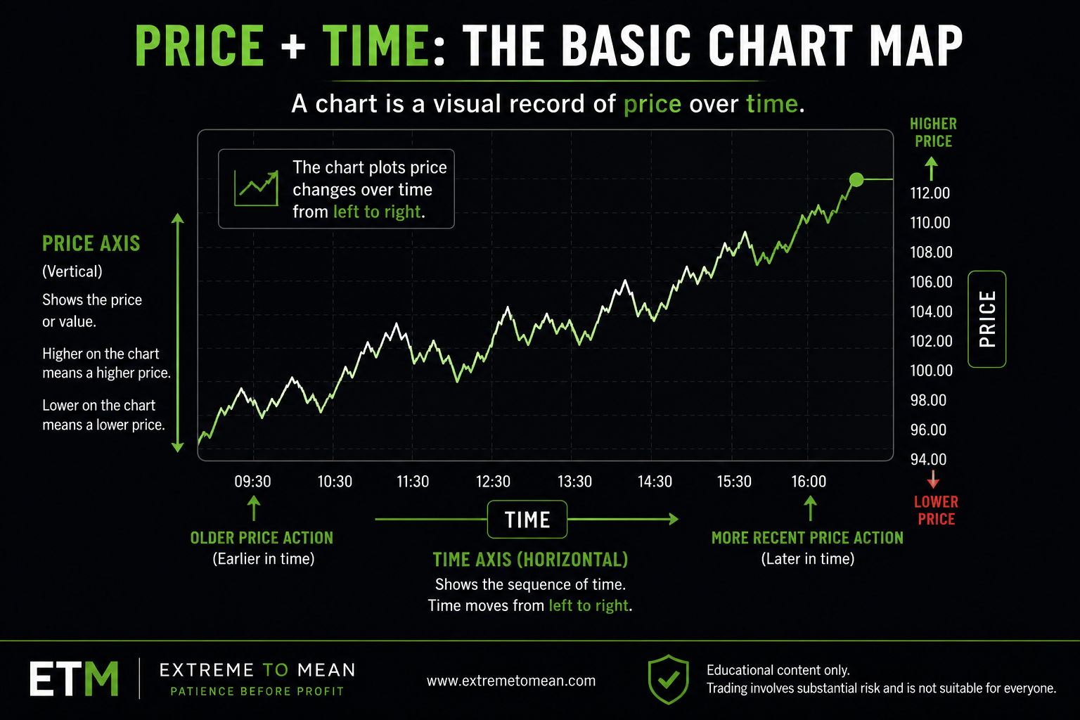
The left side of the chart is older information. The right side of the chart is more recent information. As new trading activity happens, the chart continues building toward the right.
This matters because trading is not just about price. It is about price in relation to time. A move that happens slowly over several hours is different from a move that happens quickly in a few minutes. A level that price visited once may matter differently than a level price has returned to again and again.
A chart helps make those differences easier to see.
The beginner mistake is thinking the chart is there to predict the next move. It is not. A chart is there to organize what has already happened so the trader can evaluate what may be happening now.
The Price Axis Shows Value
On most trading charts, the vertical axis shows price.
This is usually the right side of the chart, although some platforms allow traders to move it. The price axis tells you the value being displayed. If you are looking at a stock chart, the price axis may show dollars per share. If you are looking at a futures chart, it may show the contract price. If you are looking at an index, it may show index points.
Higher on the chart means a higher price. Lower on the chart means a lower price.
That sounds obvious, but it is important. When price moves upward on the chart, the market is trading at higher prices than before. When price moves downward, the market is trading at lower prices than before. Every chart reading starts with that basic orientation.
Price alone, however, does not explain why the move happened. A chart may show that price rose, but it does not automatically explain whether buyers were strong, sellers were trapped, news hit the market, liquidity changed, or the move was part of a larger trend. Those are interpretation questions that come later, including how volume adds context to price movement.
The chart’s first job is simpler: show the trader where price moved.
This connects directly to the earlier lesson on buyers, sellers, and price. A chart is the visual record of that ongoing negotiation. Buyers and sellers interact, trades occur, and price changes. The chart turns that activity into something the trader can see.
The Time Axis Shows Sequence
The horizontal axis shows time.
This is usually the bottom of the chart. It may show minutes, hours, days, weeks, months, or years depending on the chart settings. The key point is that time moves from left to right.
A beginner should get comfortable asking, “What happened first, and what happened after?”
That question sounds simple, but it is powerful. Price does not move in isolated dots. It moves in sequence. It may rise, pause, fall, recover, push higher, fail, or drift sideways. A chart helps the trader see that sequence instead of staring at one price by itself.
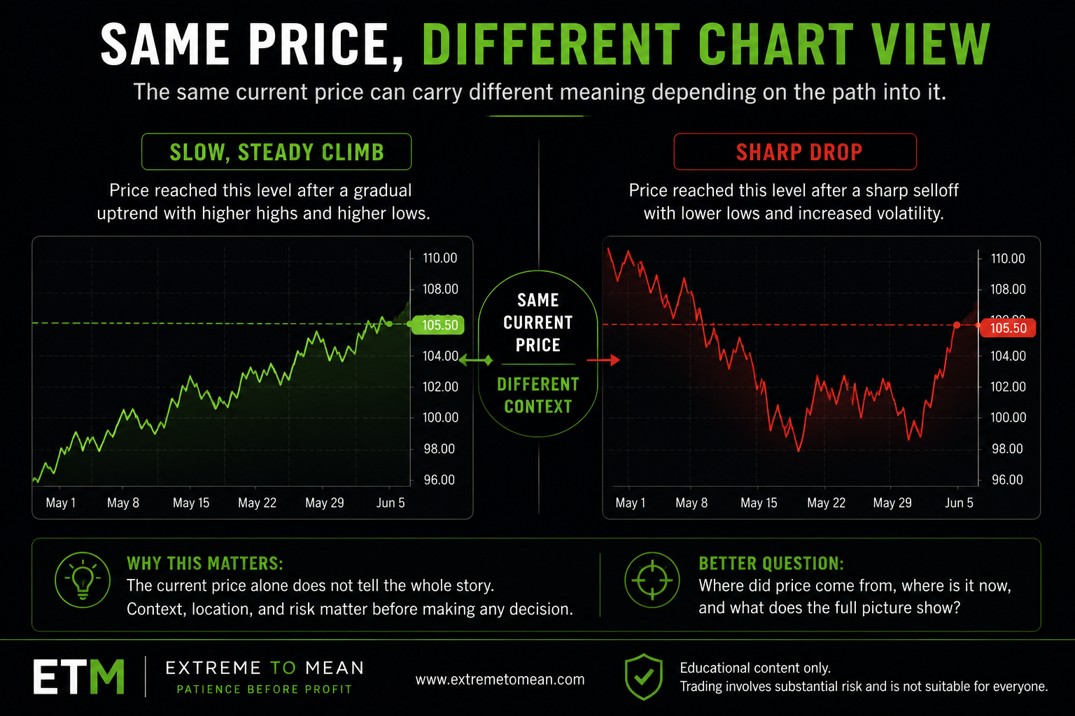
This is why two markets can be at the same price but tell different stories.
One chart may show price slowly climbing into that level after steady buying. Another chart may show price crashing into that same level after a sharp selloff. The current price may be identical, but the path into that price is different. The chart gives the trader that path.
Time also helps traders avoid overreacting to a single moment. A price move that looks dramatic on a very short view may look small on a wider view. A move that seems random at first may make more sense when seen as part of a larger sequence.
This does not make the future predictable. It simply gives the trader more context before acting.
Charts Help Traders See Movement, Not Certainty
A price chart can show direction, speed, pauses, ranges, and repeated areas of interest. But it cannot guarantee what happens next.
This is where many beginners get into trouble. They see a chart moving higher and assume it must keep going. They see a chart moving lower and assume it must keep falling. They see a sharp move and feel like they need to react immediately.
That reaction feels reasonable because charts make movement visible. Movement gets attention. A rising line feels like opportunity. A falling line feels like danger or urgency. But movement alone is not the same as a trade setup.
A chart may show price going up, but that does not mean buying is automatically a clean decision. A chart may show price going down, but that does not mean selling is automatically a clean decision. The trader still needs context, location, and risk.
This is the same idea from the lesson on long vs. short trade direction: direction tells you which way a trade benefits, but it does not tell you whether the trade is worth taking.
Charts become useful when they slow the trader down instead of speeding the trader up. They help the trader ask better questions. Where did price come from? Where is price now? Is this area important? Is the move extended? Is the market clean or messy? Is there enough information to make a decision?
The chart should not pressure the trader into action. It should help the trader evaluate before acting.
The Same Chart Can Look Different Depending on the View
A chart is not one fixed picture. It changes depending on what the trader chooses to display.
If you zoom in, small moves look larger. If you zoom out, those same moves may look less important. If you look at one day, price may appear volatile. If you look at several months, that same volatility may be only a small part of a larger structure.
This is why beginners should be careful about making decisions from a chart view they do not understand. The platform may show a clean-looking move, but the view may be too narrow. Or the chart may look confusing because the trader is trying to see too much at once.
A price chart is a tool, and the settings matter. One of the most important settings is what a chart timeframe actually means.
It also helps to understand how session periods shape the trading day, because the same price movement can feel different before the open, during the regular session, or after the close.
The trader needs to know what instrument they are viewing, what time period is displayed, and what kind of chart is being used. A stock chart, ETF chart, futures chart, and options chart may all involve price, but they do not represent the same product mechanics. That is why the earlier article on stocks, ETFs, futures, and options is helpful before assuming all charts behave the same way.
The chart is only useful when the trader knows what they are looking at.
Without that awareness, a trader can become overconfident. They may think they see a setup when they are really just looking at a zoomed-in move with no larger context. Or they may ignore a useful area because the chart is too cluttered, too compressed, or set to a view that does not match the decision they are trying to make.
A better trader does not ask only, “What does the chart show?”
A better trader asks, “What chart am I looking at, over what period of time, and what decision am I trying to make from it?”
A Simple Chart Reading Filter
Before trying to interpret a chart, a beginner should first orient themselves.
Start with the basics:
- What market or instrument am I looking at?
- What does the vertical price axis show?
- What does the horizontal time axis show?
- Is price generally moving up, down, or sideways in this view?
- Did price arrive here slowly, quickly, or unevenly?
- Am I looking at enough context, or only reacting to the most recent move?
- What decision am I trying to make from this chart?
These questions are not advanced technical analysis. They are orientation questions. They help the trader avoid jumping straight from seeing movement to taking action.
That matters because a chart can create the illusion of clarity. A sharp move can make the next decision feel obvious. A clean line can make the market look more predictable than it really is. A beginner may believe the chart is “telling” them what to do, when the chart is only showing them what has already happened.
The cleaner process is to observe first, interpret second, and decide last.
This is where Patience Before Profit begins at the most basic level. A chart is not a command. It is information. The trader still has to evaluate whether the information is useful, whether the risk is clear, and whether the decision deserves action.
For traders who are new to the Extreme to Mean process, the best next step is to start with the beginner trading path before trying to turn every chart movement into a trade idea.
Final Thought
A price chart is a visual record of price over time.
The vertical axis shows price. The horizontal axis shows time. Together, they help traders see movement, sequence, and context more clearly than a list of prices could.
But a chart does not predict the future. It does not tell a trader what to do by itself. It only organizes information so the trader can evaluate the next decision with more structure.
The better trader does not open a chart and immediately react. The better trader asks, “What am I looking at, what has price done, where is it now, and is there enough context to make a decision?”
That is how a chart becomes useful.
Educational content only. Trading involves substantial risk and is not suitable for everyone.